Peerspace
Mobile app that helps students at University of Toronto overcome “failure”
Team
Ava Xu(Myself), Andy Pham, Anne Feldman, Ivy Zhang, Miko Wu
Tools
Figma, Mural, Adobe Photoshop
Deliverables
Four 8-minute team presentations
Interactive medium-fidelity prototype
My Contribution Highlights
Team Coordinator: Established efficient workflow processes, monitored productivity and implemented several collaboration tools such as team agenda and stand-up meetings to improve overall work performance.
User Research: Responsible for secondary research consolidation, interview script iteration.
Define: Identified the user needs using multiple UX tools with the team.
Design: Responsible for making sequential storyboard and finalizing interactive mid-fi prototype.
Evaluation: Designed and conducted usability test with Miko Wu.
So, let’s talk about failure!

What’s Failure?
Think back to a setback or a failure you experienced during school years.
Maybe you didn’t get the grade you expected on an exam?
Or, you weren’t able to obtain an internship position?
What about maintaining a healthy school-life-work balance?
Due to the taboo of failure, our preliminary research indicates that many students have been facing high levels of pressure and having a hard time navigate through their academic or personal setbacks.
What Users Are Saying
“Academic failure makes you think that you're not smart enough to be here at UofT."

How Can We Help?
In partnership with the University of Toronto’s (UofT) Innovation Hub who aims to help students improve campus experience, we decided to challenge ourselves to design a digital solution to help those students encountering failure.
Introducing Peerspace
Click the play button on the left to watch a 3-minute video on how we addressed our users’ pain points with an empathetic community that fosters genuine connectedness among all UofT students.
How did we arrive at Peerspace?
Design Process
The design process is composed of five 2-week sprints, each included an 8-minute playback session where we story told our progress in front of 3 industry experts and other stakeholders to exchange feedback and reflect on the design.

Initial Design Question
How can we help students at the University of Toronto process failure more effectively and efficiently?
User Research: Understand the Context
51
Survey Participants
12
Interview Participants
In addition to secondary research, our team conducted 12 semi-structured interviews and surveyed 51 representative users - all UofT students or recent graduates within different faculties across the undergraduate, graduate and PhD levels.
I iterated the interview script, conducted 2 user interviews, helped send out the surveys, and was responsible for organizing and presenting the secondary research data.
Data Analysis: Look Into the Problem Space
We utilized an affinity diagram to analyze the qualitative data and graphs to visualize the quantitative data. Then, each member voted on the affinity diagram to narrow down the problem areas we would like to focus on later.

Research Highlights From Users

Pain Points
Lack of Support: Help-seeking at UofT is described as impersonal and inaccessible.
Imposter Syndrome: Struggle with imposter syndrome under a culture of academic excellence.
Shame Around Failure: Feel embarrassed when perform below expection.

Insights
Peer Support: Peers are able to fulfil unmet needs by providing empathy, hope, and rapport.
Shared Experience: Sharing vulnerabilities with others in the same boat is a highly effective way to cope with setbacks.
Anonymity: Anonymity can help destigmatize “failure“ and facilitate honest conversations.
Meet Isabelle the International Student
In order to to avoid unconscious biases, our group crafted our persona strictly grounded on the user research data.
We also created an empathy map to visualize Isabelle’s attitudes, emotions, and behaviours. In that way, we can better understand and prioritize her needs.
Click to enlarge the photos
Studio Work-In-Progress: Proto-Persona & Empathy Map
Dig Deeper: Identify the Needs
Isabelle’s as-is scenario is a journey of receiving 68% on a midterm, a grade way below her expectations as a straight A student. The journey map below visualizes the steps, thoughts and her happiness level along the entire journey.
This helped us identify specific areas where Isabelle needed the most support.

Isabelle’s As-is Scenario: Steps, Thoughts, and Happiness Level
Reframe Design Question
When students experience failure, how can we foster a genuine connection with others who share common experiences at the University of Toronto, in order to create a safe and empathetic community that encourage self-compassion?
Ideation: Spark Off Ideas
Having the design question in mind, the team came up with 16 unique ideas and each member voted based on feasibility and impact. Then, we plotted them onto a prioritization grid and got our four “Home Run“ ideas that had the highest impact and easiest feasibility:
SOS signal: An immediate announcement to express the need for support;
“Same Boat” Alert: Reminding one another that we are not alone in our struggles;
Anonymous Forum: Anonymous topic-based forum for student struggles;
Fake Identity: Concealing real identities to have authentic conversations.
By plotting these four ideas on the as-is scenario, we were happy to see that our solutions will cushion that blow when Isabelle is in her emotional dip.

Prototyping & Usability Testing #1
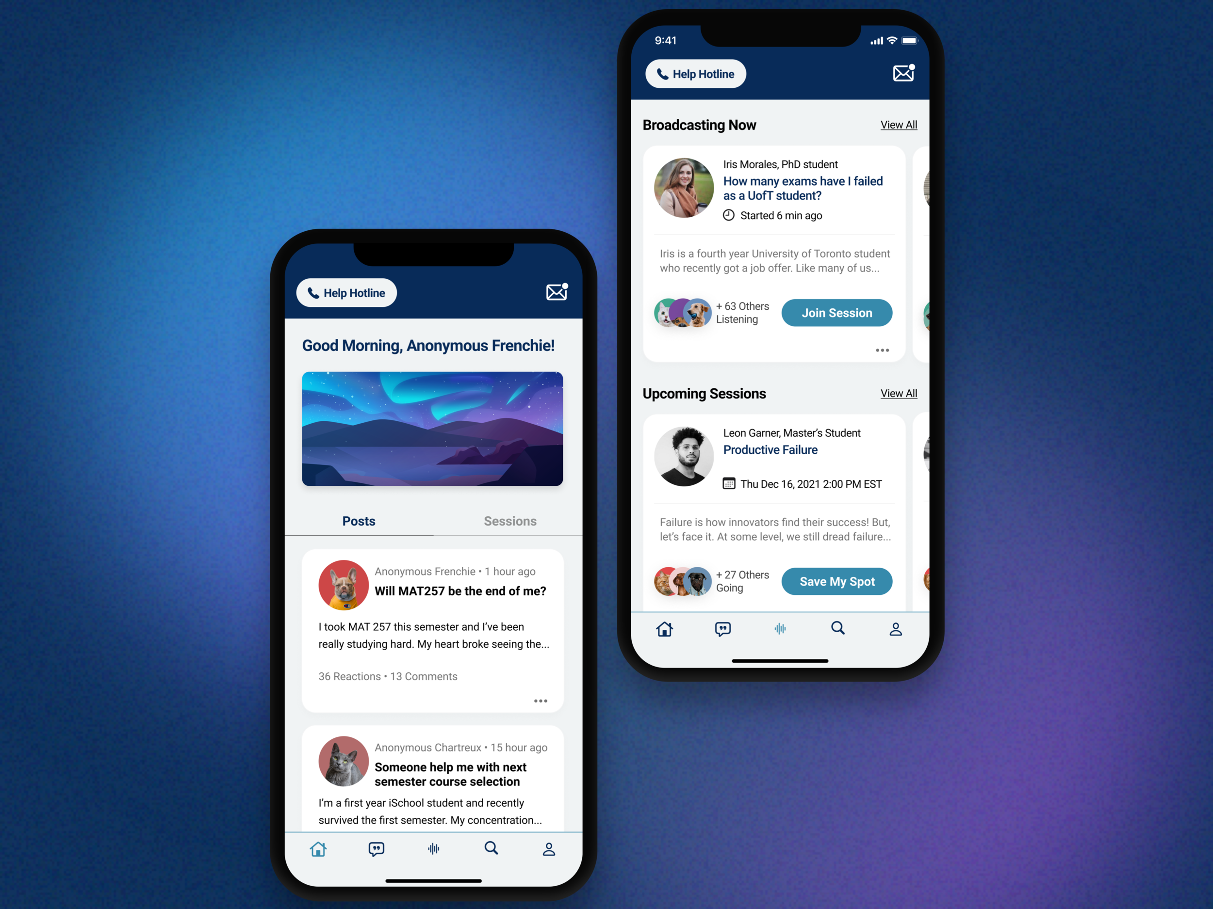
With Isabelle and her pain points in mind, we created a low-fidelity paper prototype. We named our app Peerspace because we want to create a safe space for peers to build support and friendship during their hardships.
Next, we came up with the following features that will address Isabelle’s needs:

Feature 1: Public Anonymous Posts
Students can write a post about their struggle, alerting the community they are in need of help. We didn’t take the original SOS signal design as words like “SOS” can be quite intimidating and cause unnecessary panic. “Writing a post” will communicate the message in a more neutral way.

Feature 2: Post Engagement
Ways of engagement include commenting and providing several reactions options such as “We are in the same boat“ and “You got this“ to a post.

Feature 3: Direct Messaging
Peers can have private anonymous conversations with one another.
Usability Testing #1
In order to test our ideas, we conducted the a lean usability testing with 4 representative users. We asked the users to finish the 3 respective tasks corresponding to the three core features above with the think-out-loud protocol.
Prototyping & Usability Testing #2
With results from the usability test, we iterated and designed 59 screens for the medium-fidelity prototype.
I was responsible for designing the new feature: “Participating sessions user flow and raise hand to participate”, as well as making sure the interactive prototype was error-free and ready to be tested.
Click here to try out the interactive medium-fidelity prototype


Usability Testing #2
With our newly iterated interactive mid-fi prototype, we conducted usability testing with another 3 representative users. With observation and user interview, we identified the following areas of Improvement for future iteration:
2 out of 3 users expressed they will not write a post first, instead they will observe others’ posts and replies. How can we make sure the user-generated content (UGC) will be as “useful” as possible to those in need?
All three users struggled with some UI elements such as small clickable areas and confusing graphics. How can we craft a more joyful experience with UI iteration?
Reflection
Teamwork Is a Dynamic Process: This project involved a tremendous amount of teamwork. To be completely honest, it was not an easy thing for 5 individuals with various backgrounds to gather together and work towards a shared goal. What inspires me even more than the final collective achievement is the optimization of the team dynamics. By implementing multiple collaboration tools, I reduced the meeting time from 5 hours to within 1 hour and enhanced the productivity. It was such an invaluable experience to learn how to foster effective teamwork.
“You Are Not the User”: It’s easier said than done. As humans, we all have unconscious biases. Without realizing it, biases can manifest themselves into design solutions. A data-informed design process including exhaustive user research and usability testing is crucial for us to uncover users’ pain points and create solutions instead of making assumptions.
We Need Broader Measurements of Success: Students’ definition of failure often focused primarily on a narrow space of academic or job-related achievement. According to our research, students were aware of the narrow notion of failure. We need more ways to define “success“ - it will allow us to be better at managing the perception of “failure“. More importantly, we will be able to learn, grow and evolve from the inevitable little bumps along the road.
Thank you for scrolling.