Redesigning Ticket System for the Elderly
A more inclusive and equitable ticket purchase experience for senior movie patrons.
Team
Ava Xu(Myself), Cindy Okrah, Mikella Seth, Ryan Mui, Shanti Hadioetomo
Deliverables
High-fidelity prototype
15-minute design pitch
35-page design report
Role
Product Designer
Tools
Adobe XD, Mural
Overview
About TIFF
Founded in 1976, Toronto International Film Festival (TIFF, often stylized as tiff) is a not-for-profit cultural organization. Although TIFF is known for hosting the annual Film Festival in September, their projects also include Bell Lightbox, which offers screenings and events all year round.

Source: TIFF.net
Problem Statement
While TIFF claims to be inclusive and senior-friendly, users constantly complain about the difficulties in navigating the overall ticket purchasing process at TIFF.net.
Upon initial examination, the inadequate system feedback and a lack of compliance with WCAG standards made the overall ticket checkout process confusing and difficult for any users.
Even more, movie patrons with accessibility needs have to call the TIFF’s accessibility number to purchase their ticket(s) as well as to request an accommodation.

Source: blogto.com
Our Solution

Design Process
The Cycle of Exclusion
Working toward inclusion involves acknowledging exclusionary design practices. After the group conducted initial user research and had a grasp of the problem space, we utilized the Cycle of Exclusion model to help us identify the exclusionary and inaccessible designs in place before we dived into the design process.
This allowed us to change our design approach to be intentionally inclusive and benefiting a wider range of groups of people.

A Non-linear Design Process
Although the traditional design thinking framework help designers quickly produce a solution, too often it fails to be inclusive. Our team embraced a non-linear design thinking framework to create a more inclusive and user-centred solution.

The User
Who: Seniors (65+) with mobility issues
TIFF has in place “Silver Screenings” where seniors can come together to watch and talk about the films they have viewed.
However, issues may arise if a senior is unable to participate because they struggle with using TIFF’s ticketing system.
Also, the needs of the aging population is becoming a critical consideration as the population is rapidly growing as you can tell from the left.

Source: CIHI
Why: Solve for one, extend to many
Age can intersect with other issues related to motor ability, such as poor vision or cognitive disabilities. The inclusive design solution will be useful to those who have the same needs due to a similar temporary condition or a passing situation.
Most importantly, purposely designing technology with seniors in mind will extend to future generations who inevitably will age and develop age-related issues. With our final design, any person should be able to purchase tickets without difficulty.

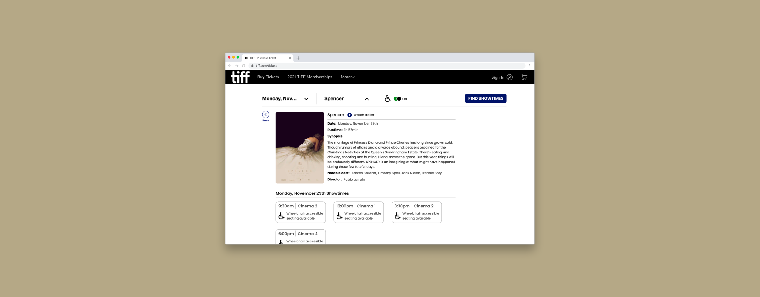
Testing with Senior Users
When we tested our prototype with senior users, they successfully performed the steps necessary to complete the overall task of finding a movie screening for a specific day, with wheelchair accessible seating selected. We also collected constructive feedback from the users which will be applied in future iterations.

Source: Unsplash
Design Specifications
Texts and Fonts
We chose a body text that has larger than standard font sizes to accommodate a variety of user types.
Both sans serif font types used on the site, “Helvetica Neue” and “Poppins”, were chosen for their high readability and wide kerning (space between characters). Text that we deemed to be important interactable elements in the user flow, such as filter menu options, buttons or accessibility resources, were given higher-level tags.

Colours and Contrast
We aimed to address colour contrast issues by keeping as much of the site as possible in black and white, thus ensuring high contrast ratios.
Contrast ratios all comply with WCAG 2.0 guideline 1.4.3 for contrast ratios. We also made sure that graphical elements that were coloured did not convey information solely through their colours.
For example, the wheelchair toggle has text beside it to indicate if it is switched “on“ or “off“, and seating legends include different icons to indicate if a seat was taken (cross) or selected (tick).

Wrap-Up
Next Steps
Due to the constraints of the project, we only conducted usability testing with seniors who have mobility issues. Moving on, we wish to test the prototype with seniors with mobility issues AND/OR:
Impaired vision;
Cognitive Issues such as declines in memory and concentration;
Are dependent on screen readers or any other assistive technologies.

Source: Diversity & Ability
Reflection
Designing for one often extends to many: Everyone needs to be accommodated for accessibility at least once in their life. If we design with a disabled person in mind, we will create a better product for everyone to use.
Designers should adopt a non-linear approach. This means we should constantly reflect and involve actual users throughout the design process (e.g. co-creation activity). After all, only users know what is valuable to them.

Embrace socially responsible design: As of 2020, there are 7.7 billion people in the world. 15% of us, are experiencing some form of disability. Though everyone is a different individual, as designers, we are inclined to use our own abilities as a baseline and create solutions that are difficult for many people to use.
It’s designers’ social responsibility to empower the users, remove any physical or mental barriers for understanding and navigating the interface.

Thank you for scrolling.